Pastel pencils - a primer
Tired of the mess and dust that comes with traditional soft pastels? Look no further than pastel pencils, a cleaner alternative that allows you to work with pastels without the hassle.
Pastel pencils combine the vibrant, rich colors of soft pastels with the control and precision of a pencil. They offer the best qualities of both mediums, enabling you to create detailed work, broad colour sweeps, or anything in between.
While some Colored Pencil Societies may not consider pastel pencils to be coloured pencils, their unique properties make them a valuable addition to any artist's toolkit.
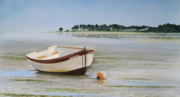 From large scenes...
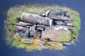 ...to intimate details
Do you need to work at an easel?
When working with pastel pencils, you may encounter some dust that tends to scatter.
Using an easel can help, as the excess dust will fall off naturally.
Alternatively, you can work horizontally and periodically tap the back of your work to remove excess dust. Experiment to find the approach that works best for you.
Another option that produces little dust is pan pastels.
Pros and Cons
Pros of pastel pencils
- The harder, more compact pastel can be sharpened to a fine point, enabling intricate details.
- The wooden casing makes pastel pencils less messy to use than other pastel types.
- Artists can work more quickly with pastel pencils compared to wax- or oil-based coloured pencils.
Cons of pastel pencils
- Covering large areas of color is more difficult, unless using hard pastel sticks for preliminary work.
- Layering pastel pencils over a soft pastel base may not yield successful results.
- Sharpening pastel pencils can pose more problems than sharpening regular coloured pencils.
Working on large areas of color proves more difficult unless you use hard pastel sticks for the preliminary work. For this reason, artists more often use pastel pencils on a smaller scale than soft pastel.
Working with pencils on top of a soft pastel base does not yield as successful results.
Sharpening pastel pencils can pose more problems than sharpening normal coloured pencils.
A knife works better than a spiral pencil sharpener. A piece of fine sandpaper can help keep points very sharp.
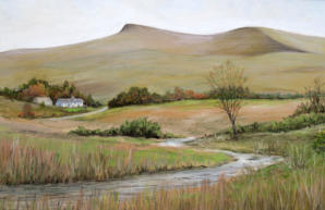 Pen y fan (Brecon Beacons) by Peter Weatherill
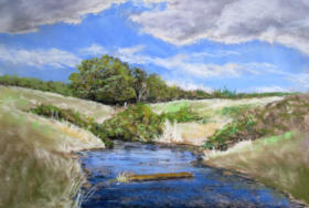 Brecon Stream by Peter Weatherill
Pastel as a Medium
Pastel shares more similarities with oils than with acrylics or watercolours.
Like oils, pastel allows for blending and reworking the surface, but it requires no drying time. What you apply to the surface is what you get - a fragile, workable medium even years later.
This fragility is why pastel artworks need to be protected with framing and glazing as soon as possible after completion.
Fixative sprays can help, but they also affect the colours and reduce the lovely glow of the pastel pigments.
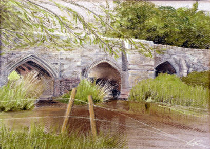 Thornborough Bridge, near Buckingham, by Peter Weatherill
A contradiction
Artists who use traditional wax or oil based coloured pencils often regard pastel pencils as the messy variety of coloured pencil.
But fans of pastel pencils consider them the clean variety of soft pastels.
What to buy
Check out our section that looks at the brands of pastel pencils available on the European market, how they differ, what colours they include and where we point out any major advantages and disadvantages. We also include the pastel sticks that some pencil manufacturers produce.
Some may argue that the sticks are not pencils. We include them because companies like Faber Castell, Cretacolour and Derwent make the content in their pastel sticks identical to the pastel content in their pencil ranges, with equivalent hardness.
Artists can therefore readily use the sticks to produce the base layers of a picture to speed up proceedings. They can then work detail over the top with the pencils. The material is the same; only the tool to put it down on the paper differs.
We will also look at the different surfaces suitable for pastel pencil paintings. These need to be fairly rough so that they grip the powdery pigment.
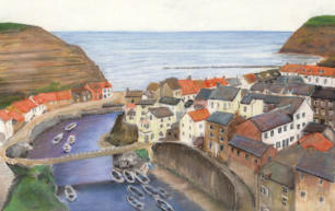 A view of Staithes, Yorkshire by Peter Weatherill
How to use pastel pencils
Here we will cover the basics of using these pencils, from learning how to sharpen them in detail, to blending techniques and troubleshooting.
We also want to share our large collection of step-by-step demonstrations with you. These will show you how an artist creates a picture, taking it through various stages until they complete the final artwork. The drawings range from simple still life to beautiful landscapes from around the world
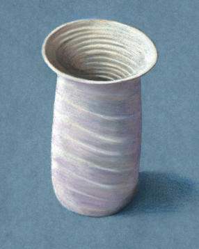
Beginners still life pastel pencil tutorial
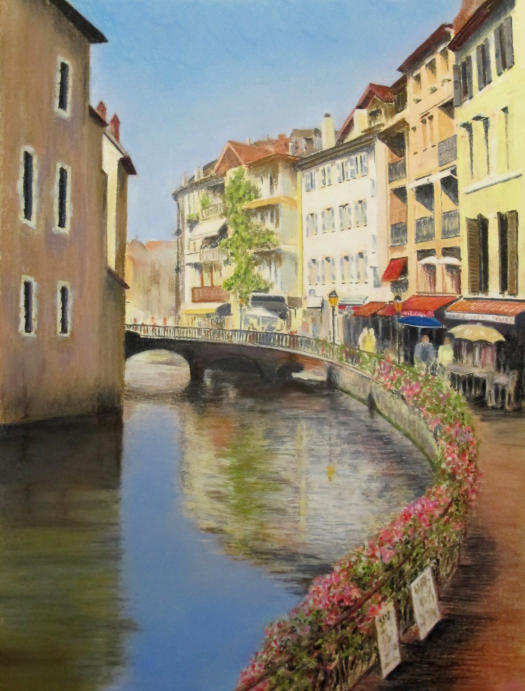
Annecy Reflections - pastel pencil drawing lesson
You might like these
Pastel pencil tutorial for beginners
A pastel pencil tutorial for beginners - learn how to blend and then paint a simple still life
Pastel pencil drawing
Pastel pencil drawing step by step - Annecy Reflections - created for Caran d'Ache


- Home
- Pastel Pencils
Would you like our occasional newsletter?
Home | About Us | Contact Us | Privacy Policy
Copyright Peter Weatherill and Carol Leather - 2009-2024